
Over 10 years ago, my father Robert decided to start a real estate business in the small town of Burns, Oregon. At the time I was in college studying design, and was the perfect candidate to help him create a logo, some branding materials and flyers, and a website. I worked with him to create a logo for the company, and used a WYSIWYG website editor to create the website.
Years later, in 2018, we came to the realization that the website was not being as helpful as it could be. At around the same time, we started talking about the brand and the logo and we started to talk about a new look for the company. One that would set it apart from the other Real Estate companies in Burns, and propel it to the top.
As we started on this task, several things became clear: The website needed to be built using a CMS, rather than a drag and drop editor (no tables, no mobile view unless you specifically made it... no sorting, bad SEO, all that) and that the brand needed to be bright— able to be seen from a distance. A competitor in town had recently changed their branding from yellow to white and green, and we saw that as an opportunity to help with that second point.
Over the next several months I learned Wordpress and created the website. It is now the best looking one in town, and is also (dare I say it) the most useful. And for the SEO? Well, see for yourself!
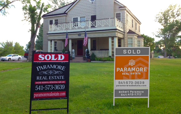
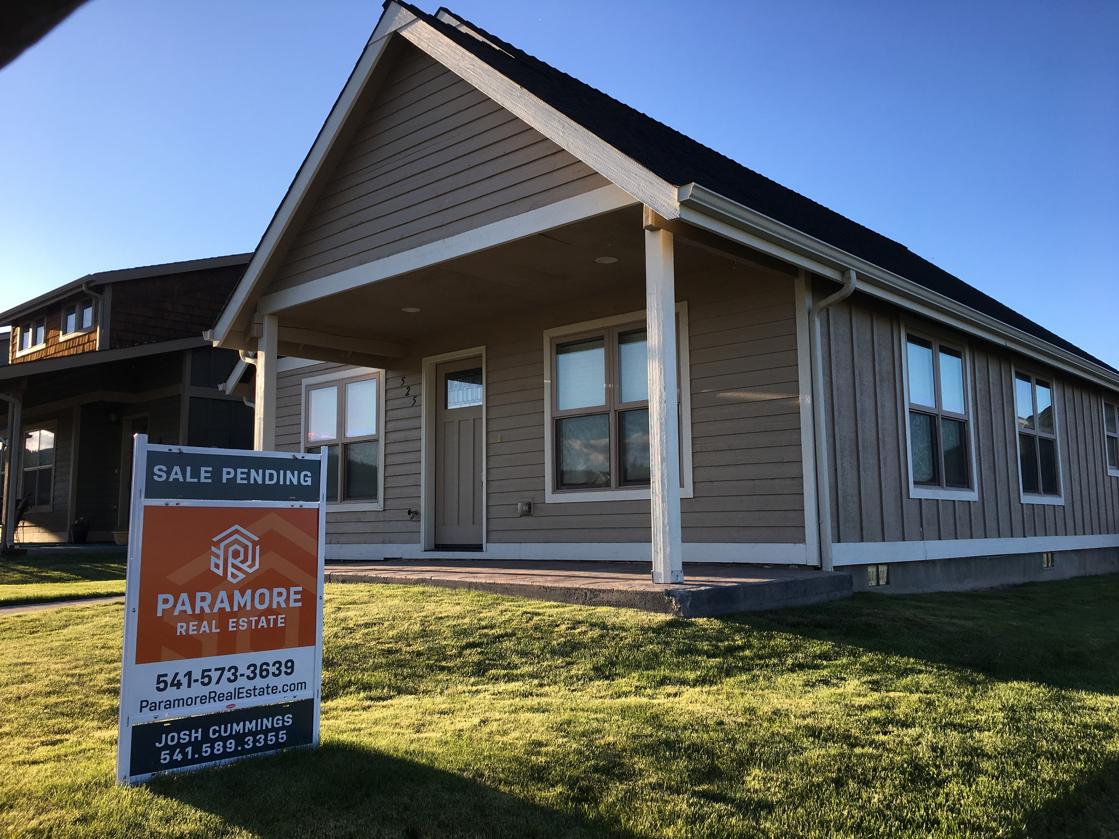
For the signs, we tested a lot of variations. We printed them out to scale to be able to see how they looked from a distance, and to see if the colors were good. We were going to be sure of them before we dropped several thousand on printing costs!
Once they arrived, we changed every sign in town at once during the night. When the town woke up the next morning, my dad started hearing from so many people wondering what had happened. The signs were everywhere! We accomplished the goal of bringing more awareness to the business, and to the fact that Paramore Real Estate is the place to buy and sell homes.
I am so proud of the business that Robert has created. He is a supreme example for me, and I am so glad I was able to put my skill to use in making his business the number 1 Real Estate business in Harney County.
"I would like a new logo that helps us stand out from the other real estate businesses in the area"
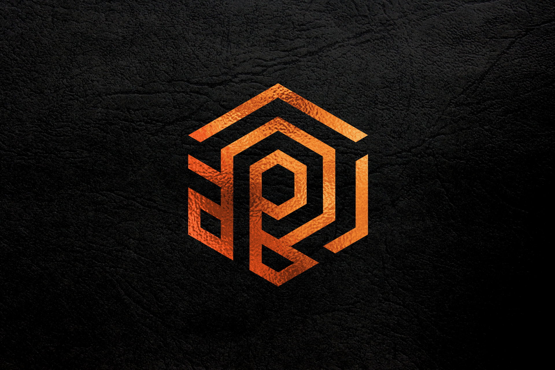
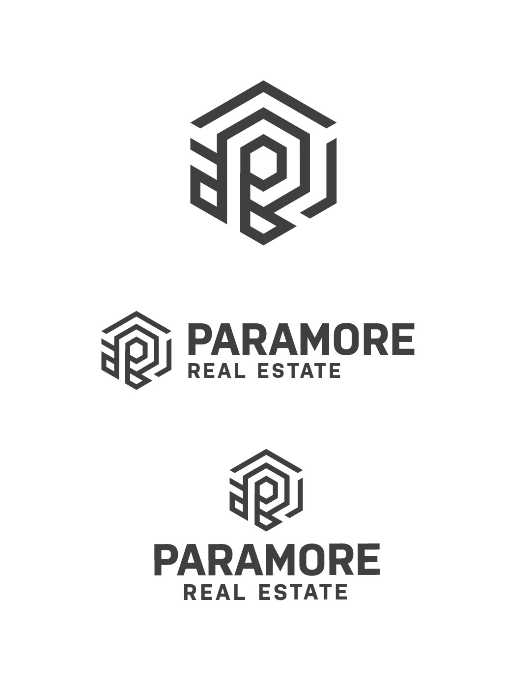
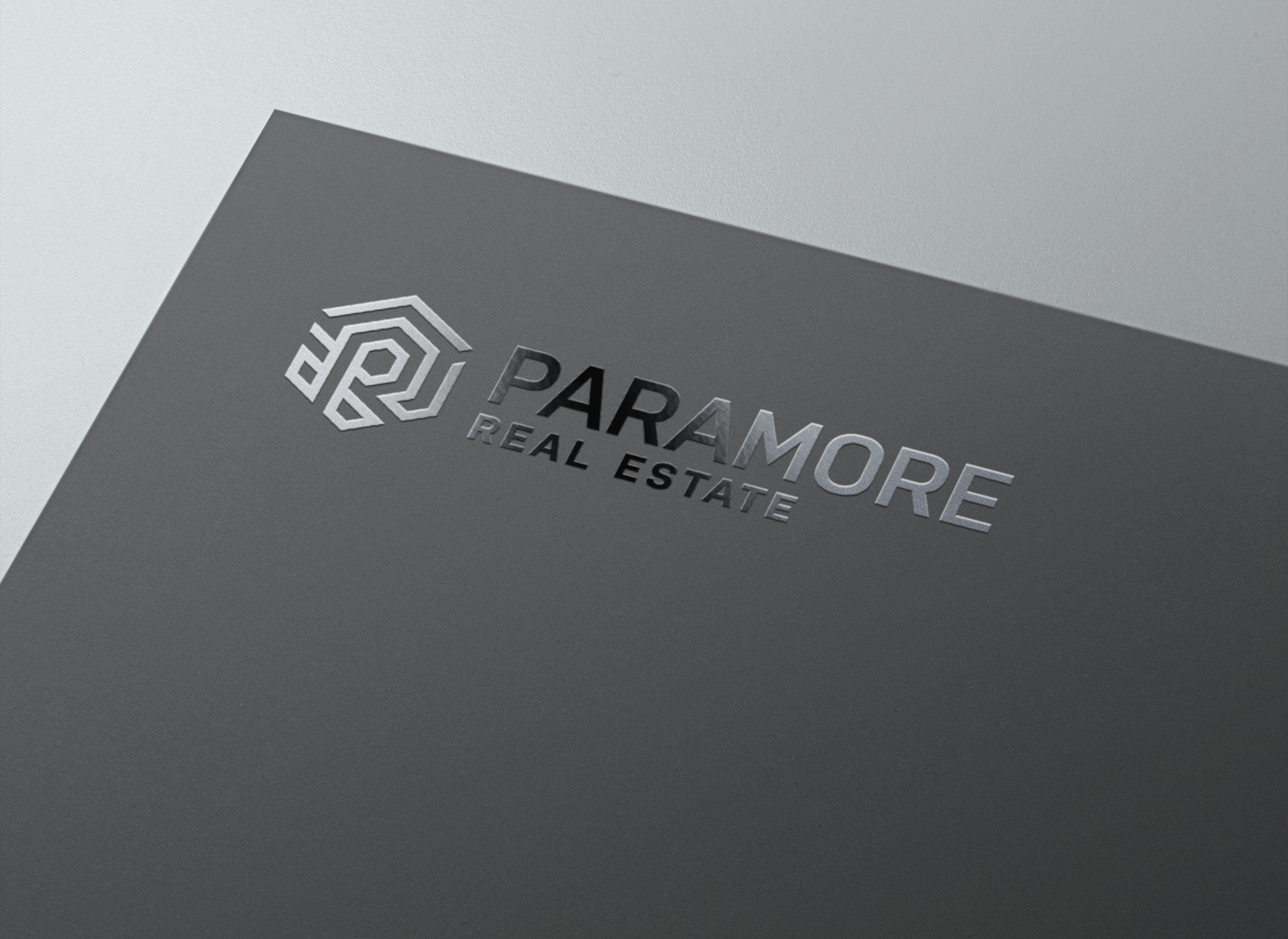
After a lot of sketches, variations, feedback sessions and mockups, we finally decided on this. A solid logo that is readable at almost any distance, is strong and geometric, and that lends to the brand name and to realty.
Old Logo
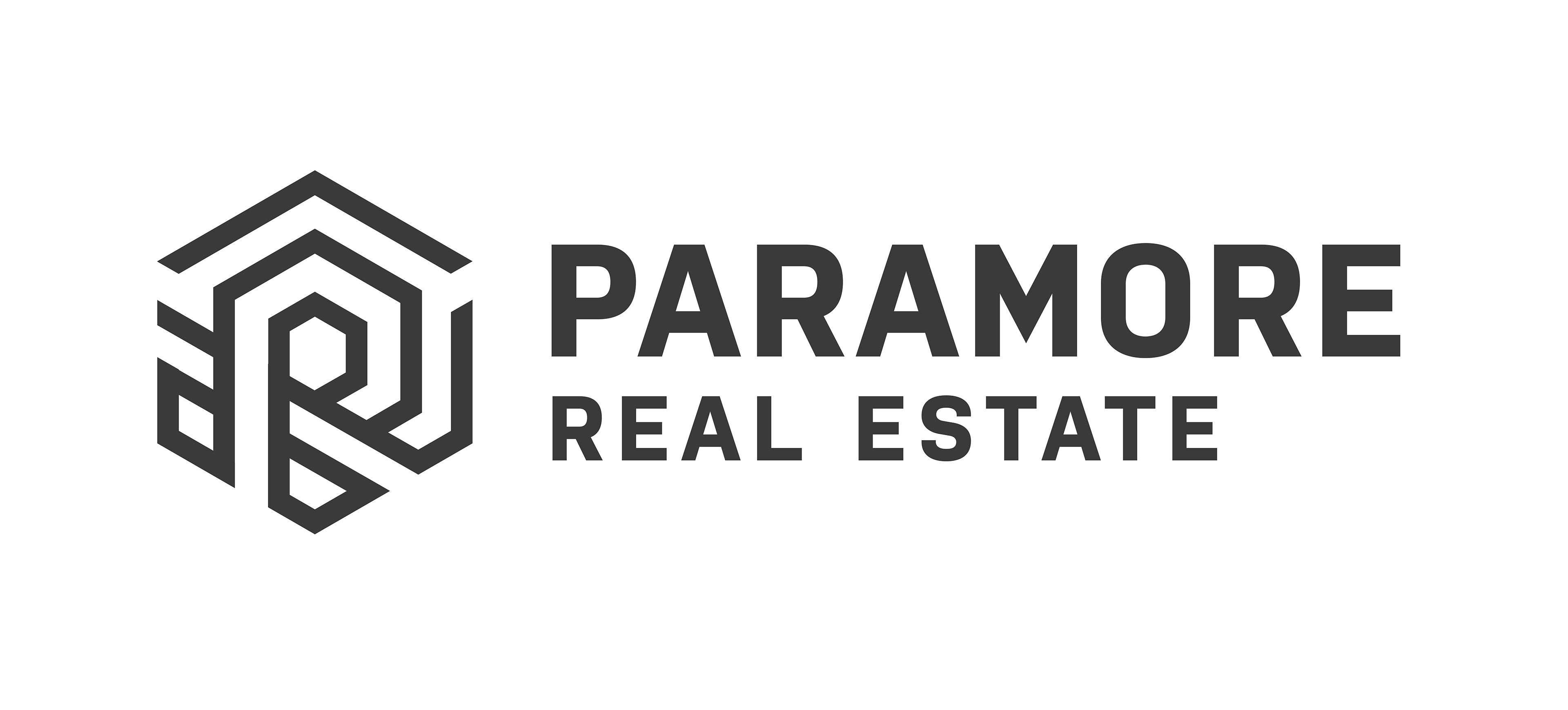
New Logo
"Your signs are everywhere!"
Since the branding update, many people have mentioned to Rob that they think Paramore Real Estate must be killing it, when actually the new signs are just way more visible than the old ones, and that of the other companies in town. It has helped increase presence.
"The website blows the other local sites out of the water."
(Its Also Mobile Friendly! Without the extra work! Saves hours and hours of work!)

The site was built on Wordpress. What was a fun month learning how to work it! But it works great, organizes everything automatically, and is easy to add and change listings. The header photo as well!
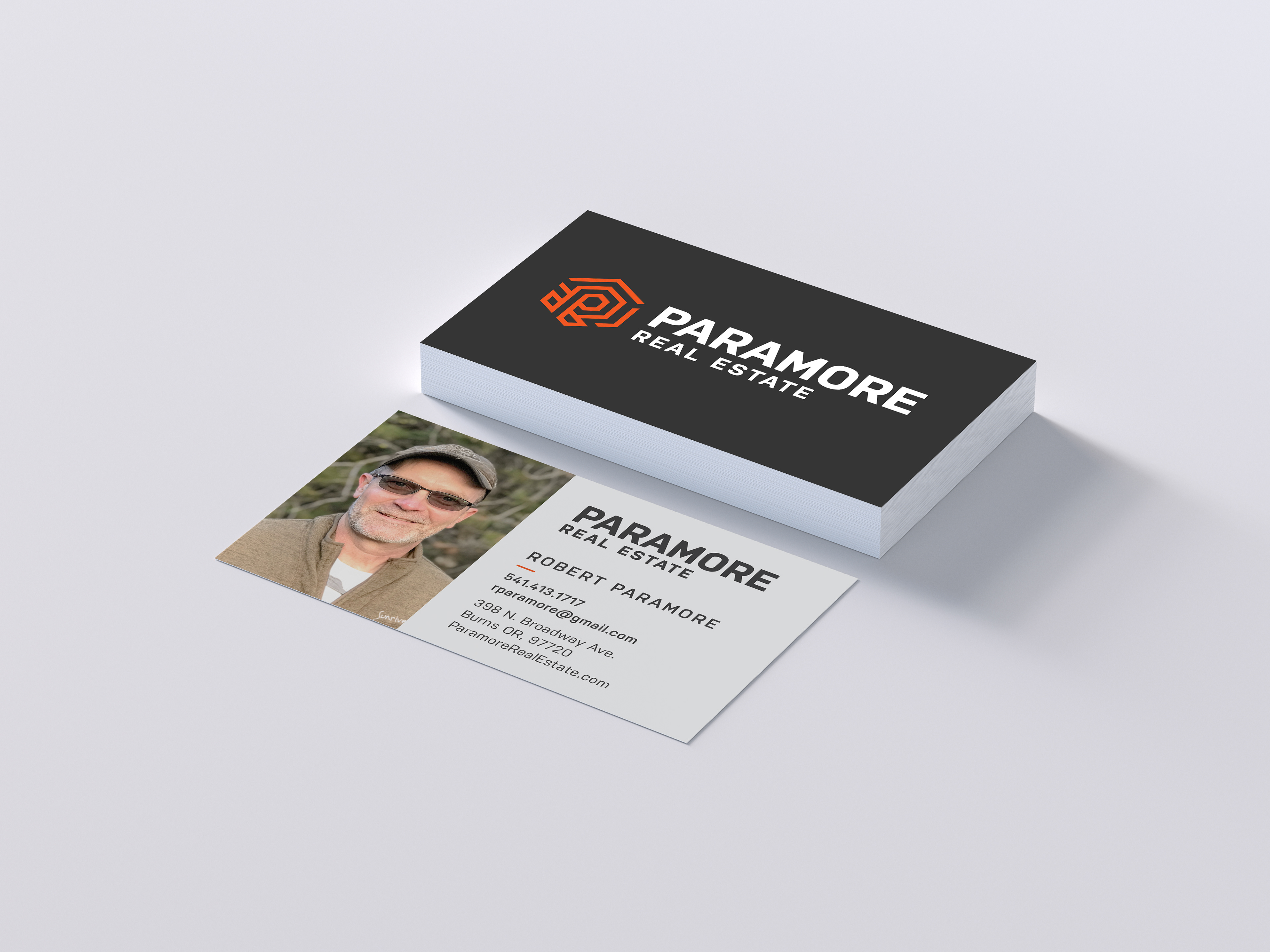
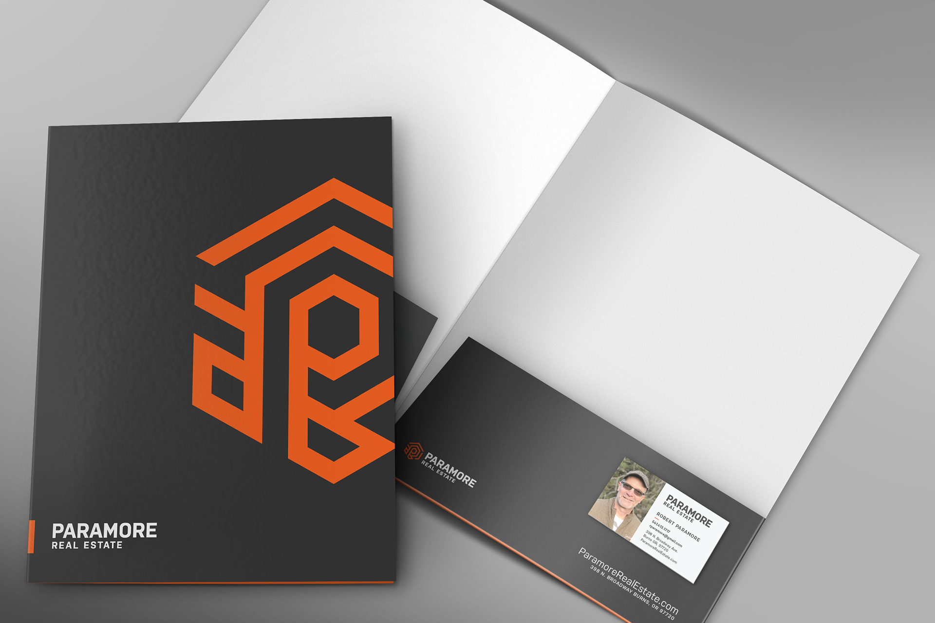
Print Materials
Business Cards were made, as well as very nice (read: Fancy Glossy Foil-y) pocket folders for all of the papers and documents that go into buying or selling a property.
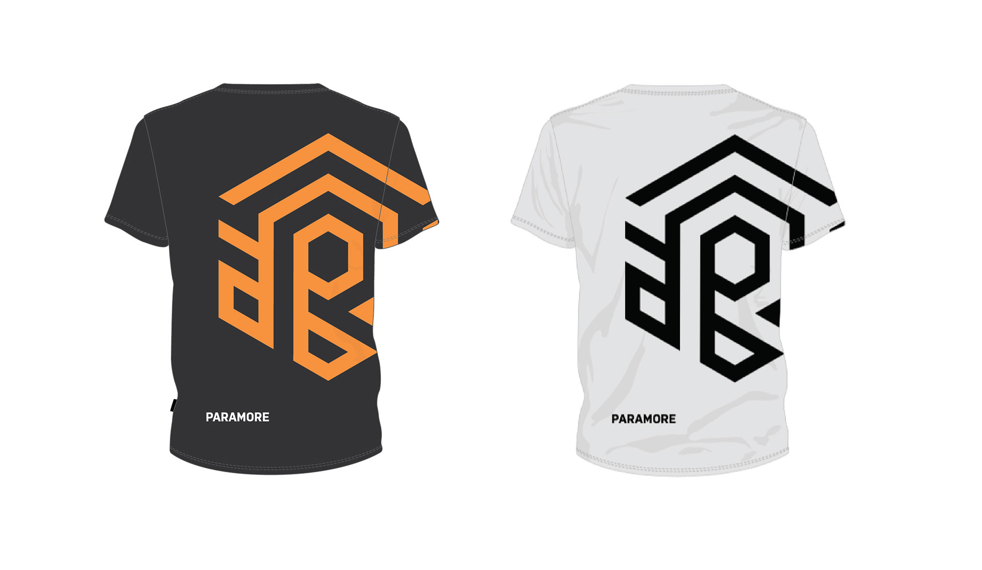
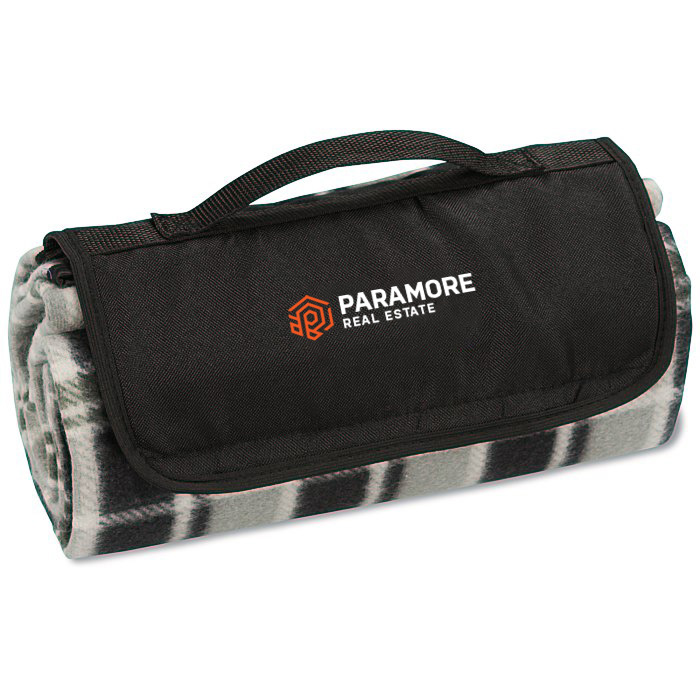
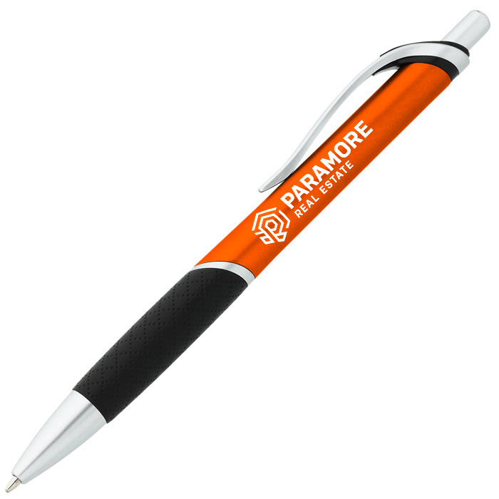
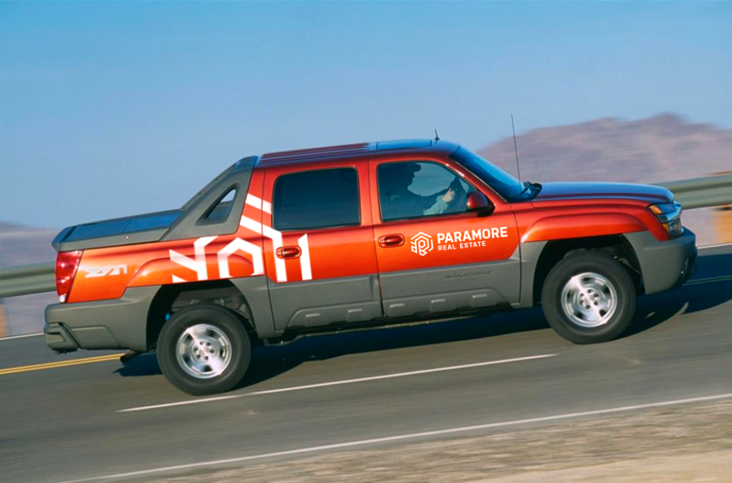
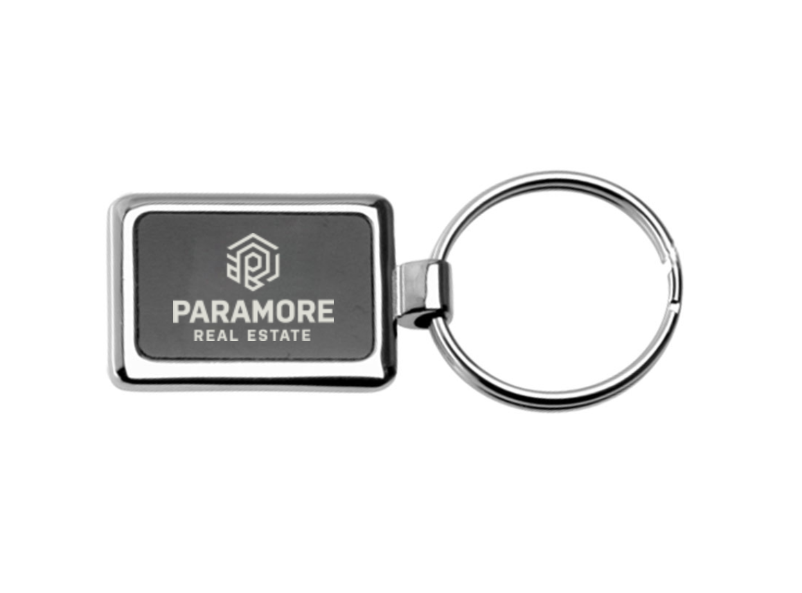
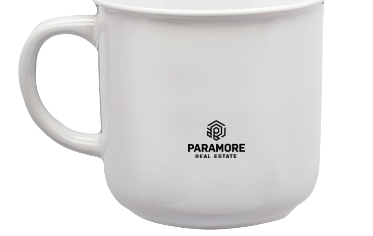
Can't Forget the Swag!
All of these items below have been made and are given out to buyers in welcome baskets.
(except for the truck of course!)
NOTE: During the process of designing this logo, and after I had created all of these mockups, we printed it out huge and put it up in the office to really see how it would look. We discovered that even after all of the work and time we put into it, that it had a problem. If you look closely at all of the logos in these mock-ups, you will notice that the center "P" area has a line that comes out toward the lower right, making it look a bit like an R. We determined that removing that line, and focusing on the P instead helped the readability, so all of the production logos were changed to it. (you can see those at the very top of this page) Even after all the work and time put into it, we were still able to look at it and make that kind of change for usability, and I am glad we were able to do that.