Back in 2015, I was approached by a friend who needed some assistance with an app they were working on. They needed help with a logo, branding, and an overall app flowchart so they could plan how to make it.
Fast forward 5 years, 3 versions, 23+ employees, 3,000+ Married couples, and over a million downloads later, and Mutual is a staple in the vocabulary of members of the Church of Jesus Christ of Latter Day Saints.
The ideas for the app come from many of us, including our users. I am glad I have the opportunity to flesh them out in design and help bring it into a usable format. I have worked as the main Product and UX Designer since it started. It has been great to work on a single product for so long, through so many iterations. The team that works on Mutual is outstanding, and I love working with them.
Our newest version of the logo (version 4) was released with the June 2019 version 3 of the app. (The Big Update!)
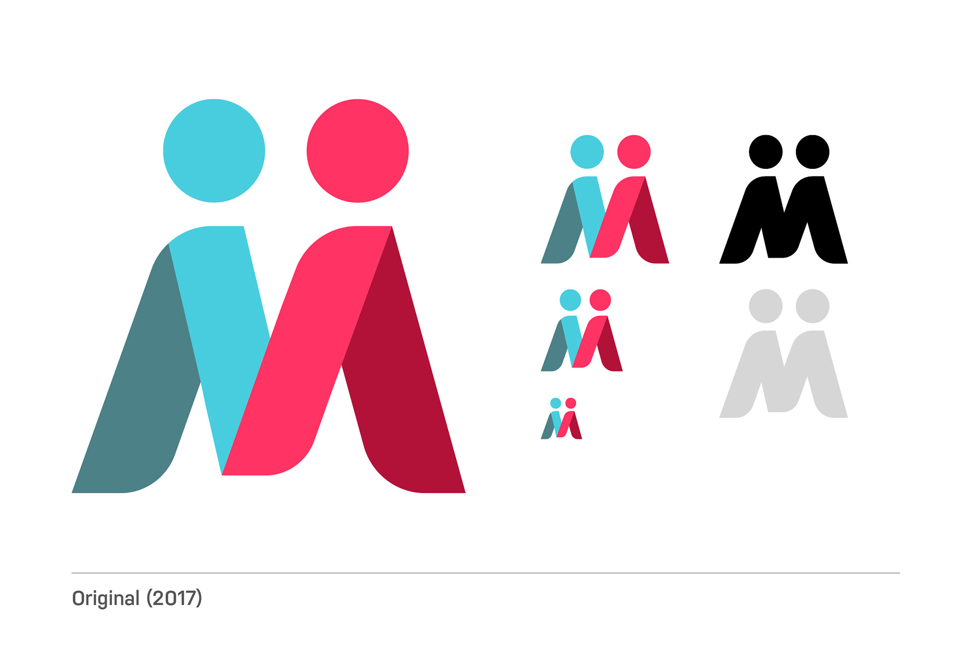
2017 Logo - Before the Rebrand
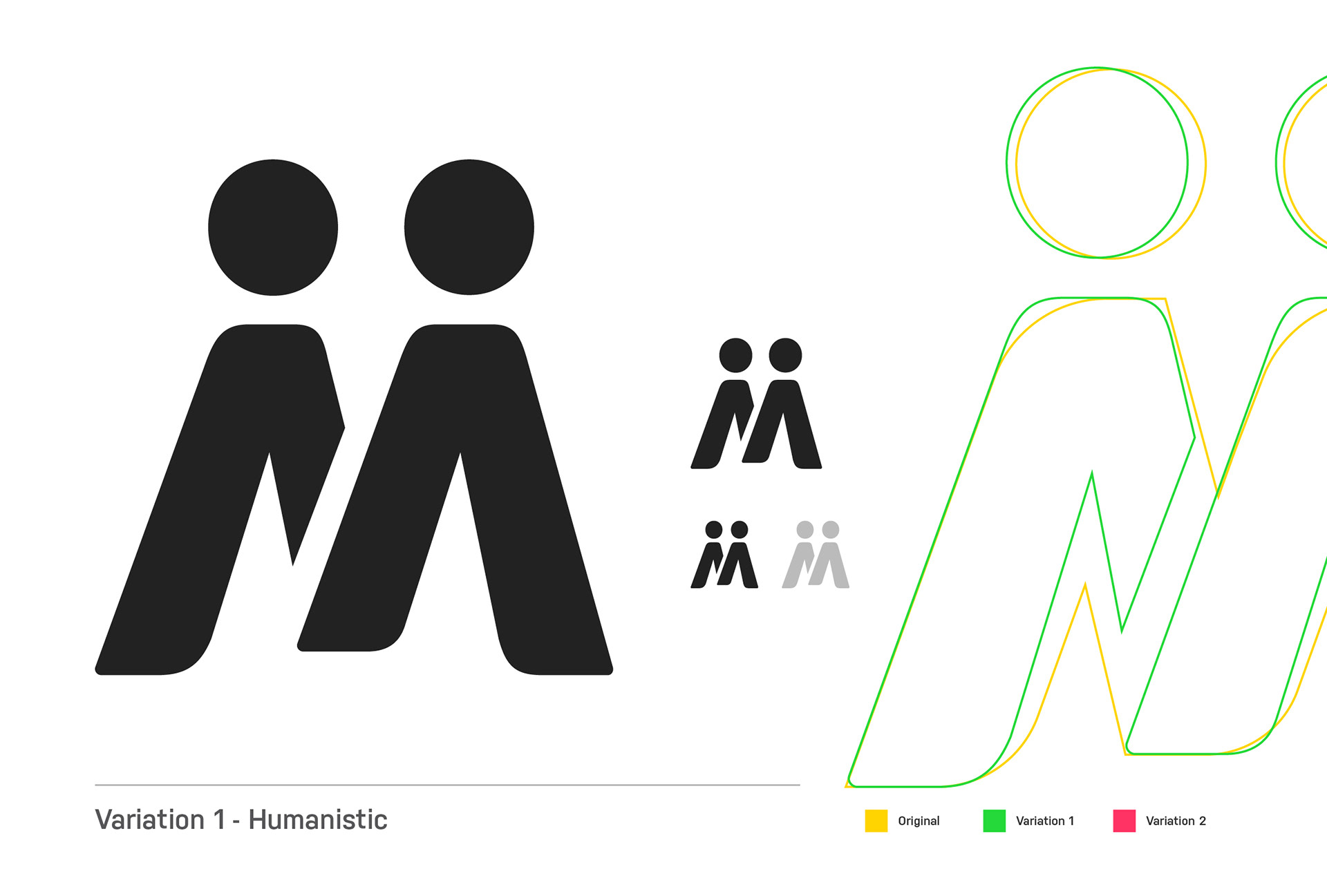
Variation 1 - Humanistic

Variation 2 - Compromise between new and Old
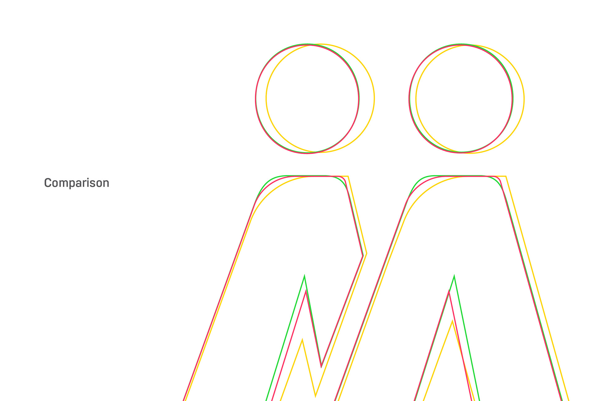
Stacked Comparison
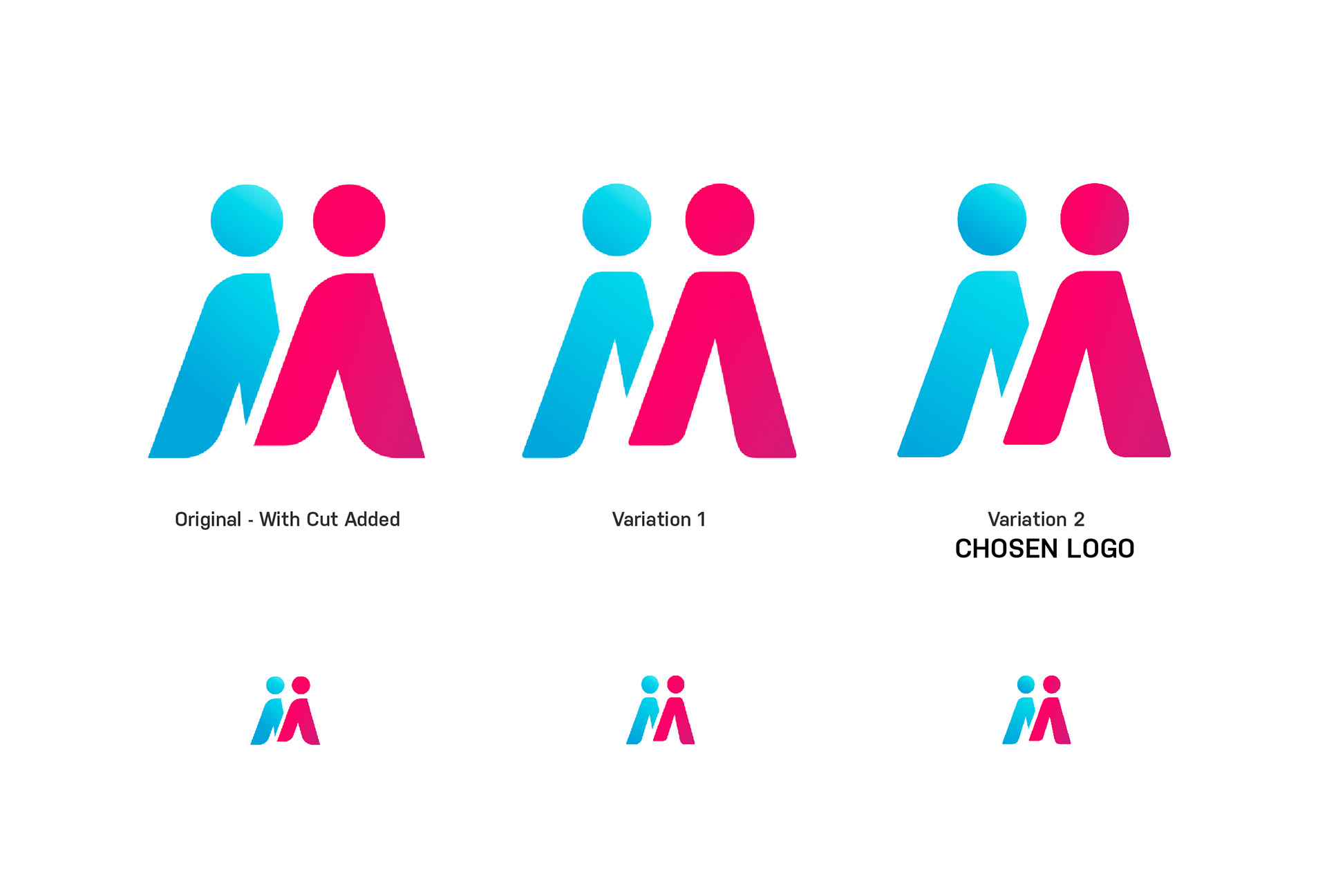
Final Three
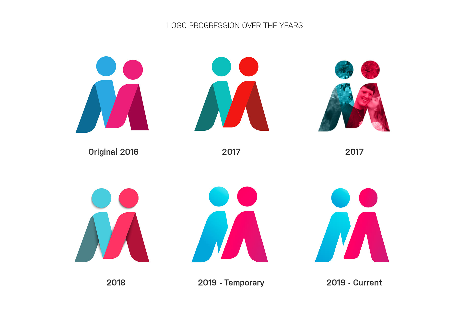
Logo Progression over the years
Finding a new color scheme and brand look. Lots of user tests. Lots of opinions.
As of August 2019, Mutual has helped over 1,200 couples meet and get married. (that we know about!)
Creating App Store Screenshots. One of the things that takes the longest. For this I needed to create a version for the iPhone X, iPhone 8 (and have them look like the phone, and be the correct size) For Android (not shown) and then translate these into Spanish and Portuguese. All in all, it ends up being between 50-70 screens. I was fed up with creating them manually so I created a sketch template to do it for me via symbols, which makes updating these now a breeze.
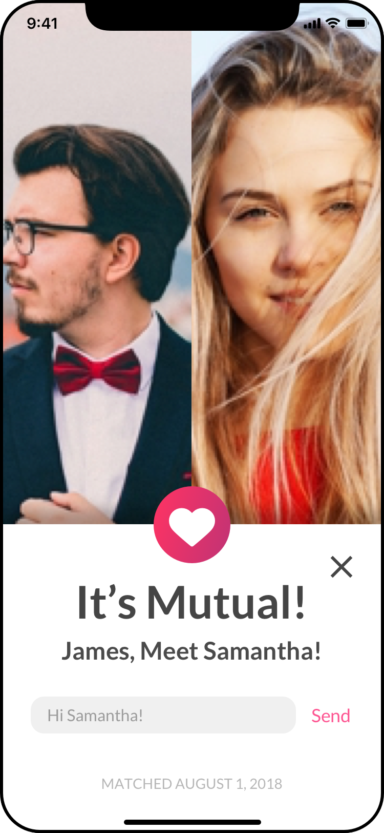
Mutual Users match with others over One Million times per month
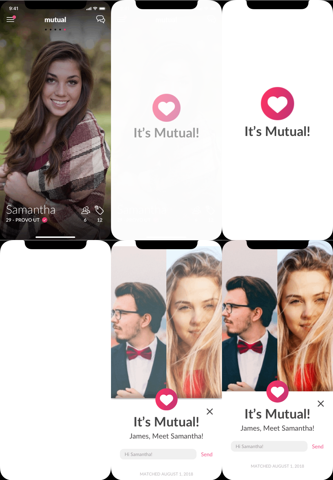
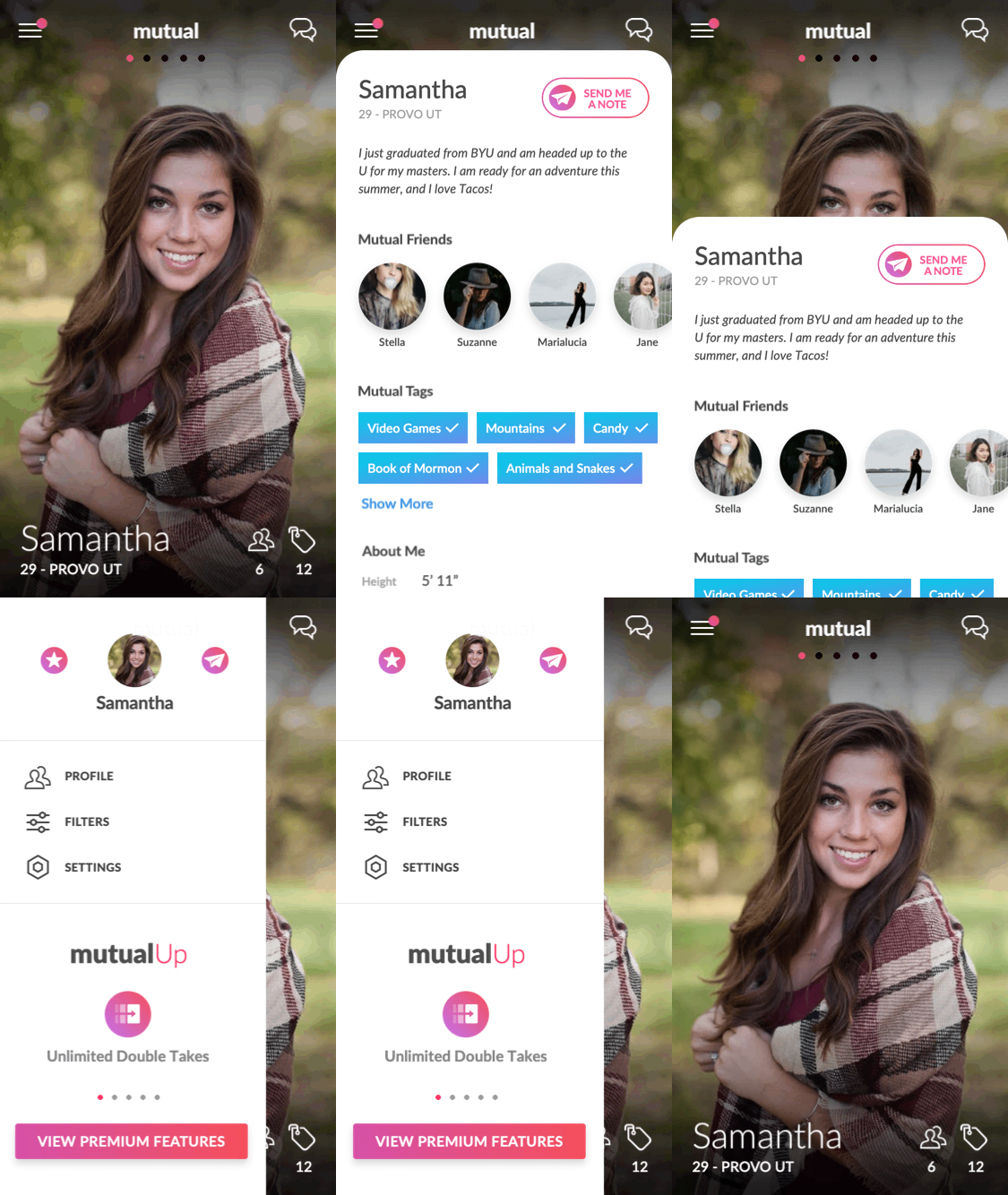

Mutual Users swipe over 100,000,000 times Per Month

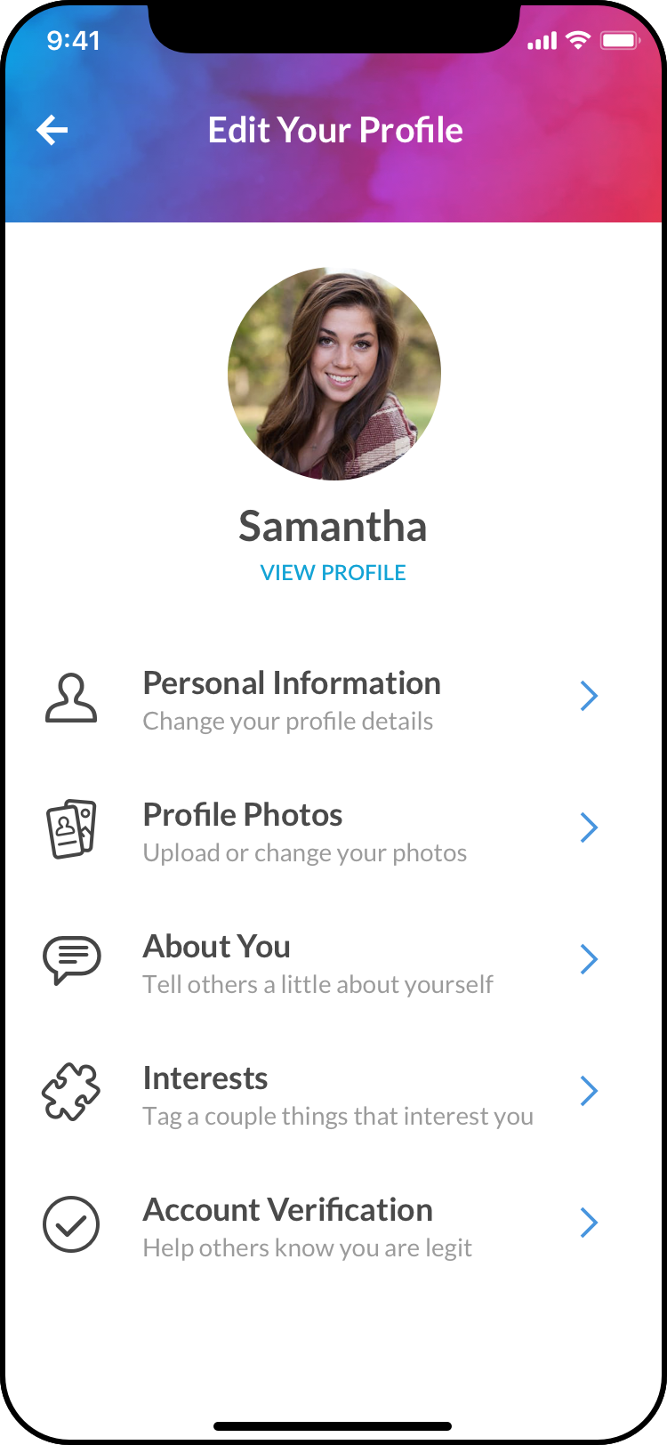
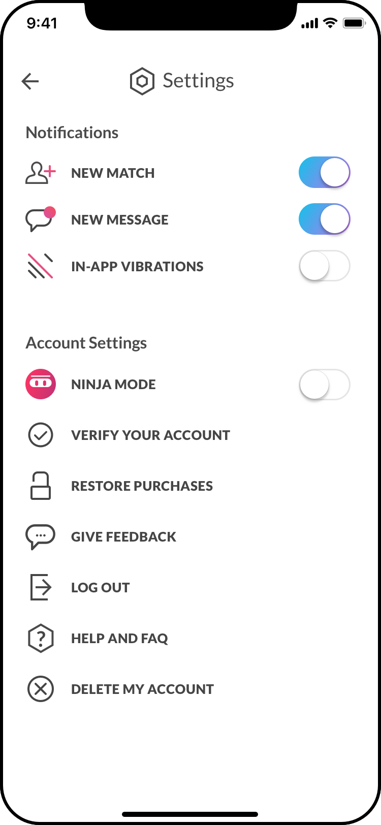

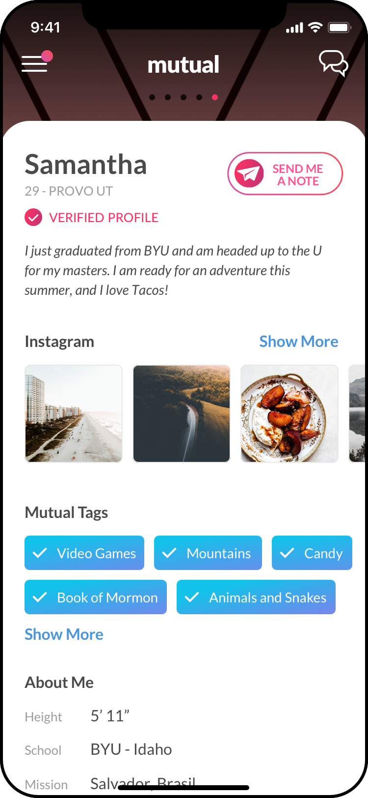
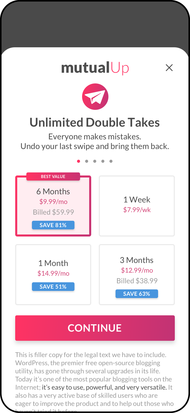

It's just a simple dating app...
how complicated could it be?
how complicated could it be?
And this isn't even showing the the admin, support, and ad portal tools! Each of the boxes represents one page, or "screen" of content, each with its own usage defined. New tools need to both fit within the old framework, as well as replace and phase out old pieces over time. Parts are replaced both gradually by altering them to look like the new design for a while, and then replaced altogether with larger updates.
Advertising
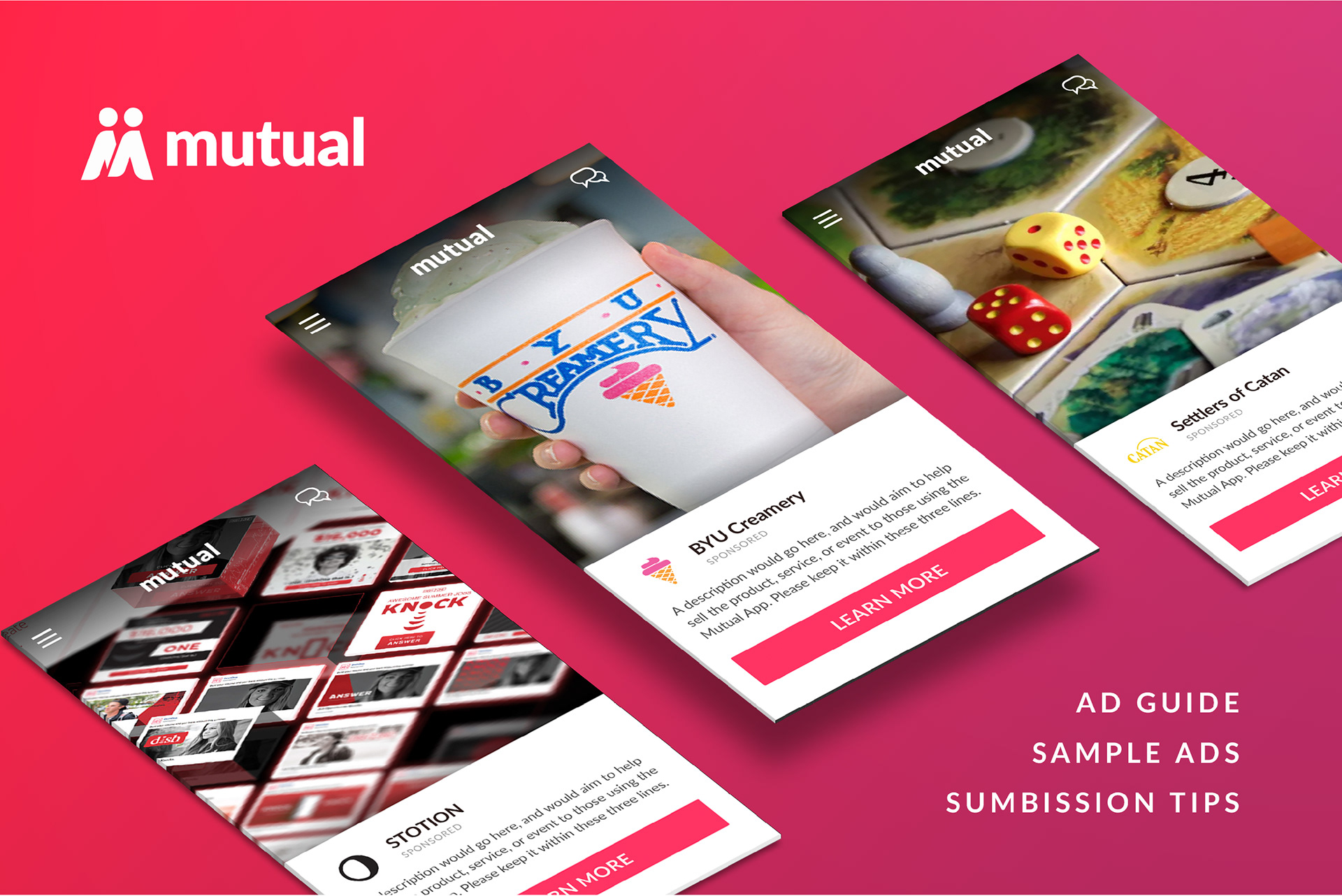
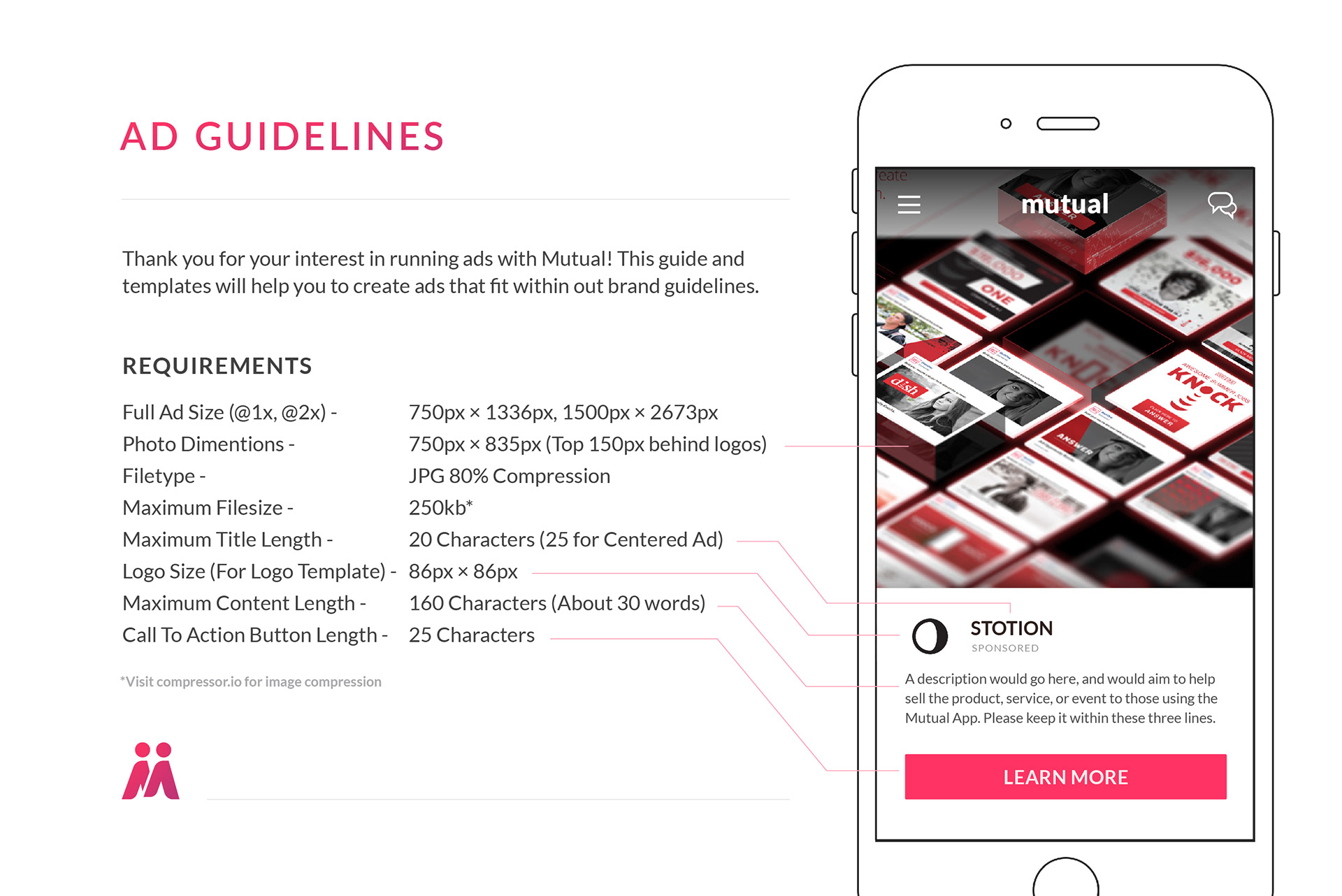
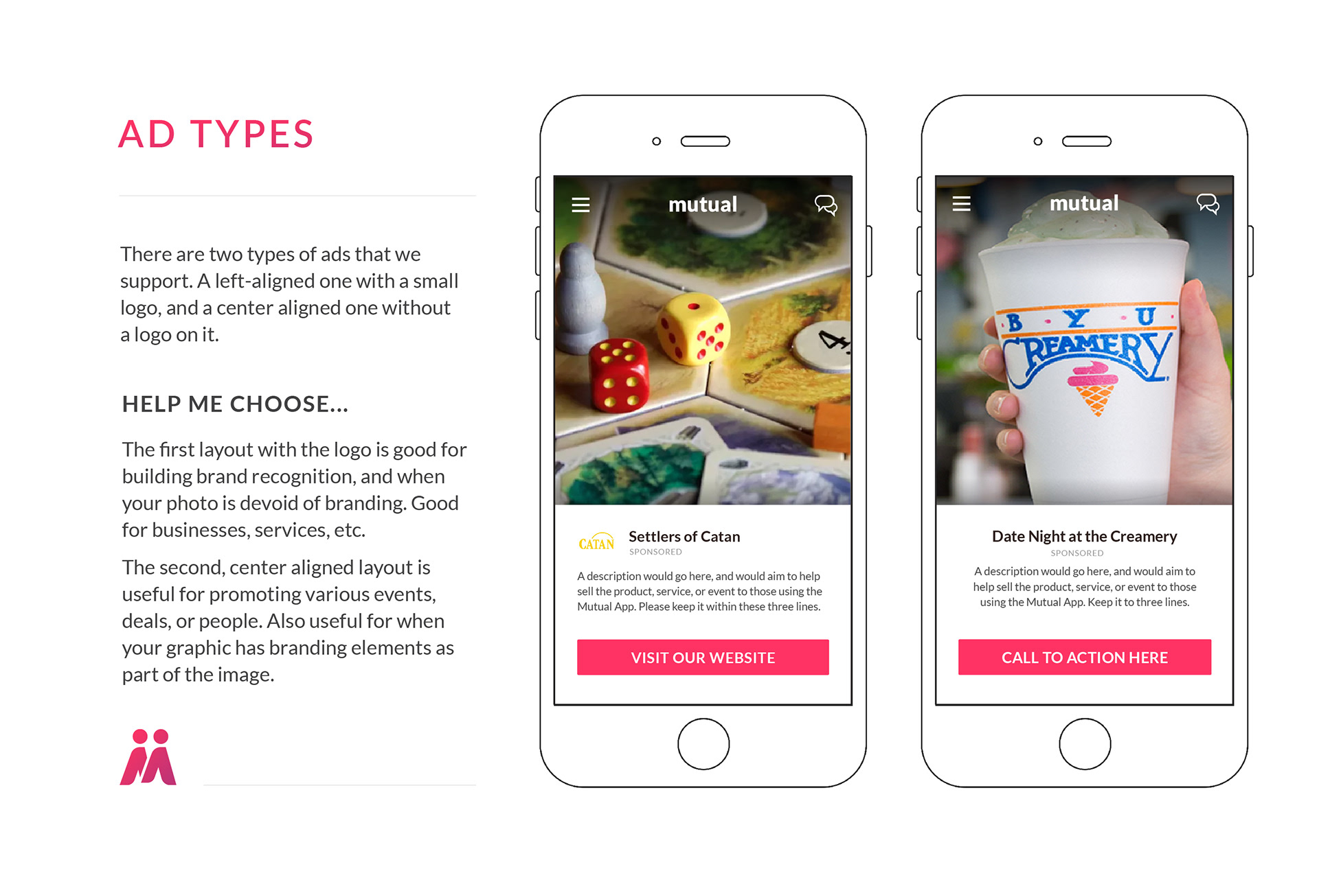
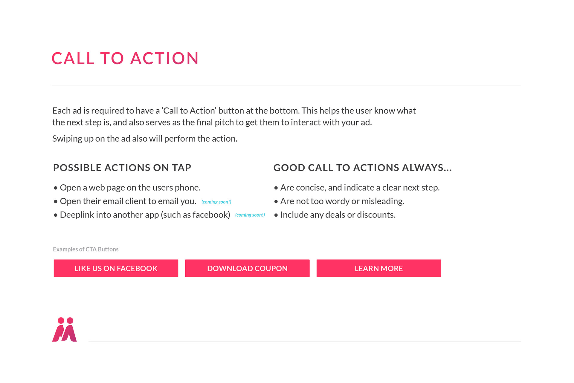

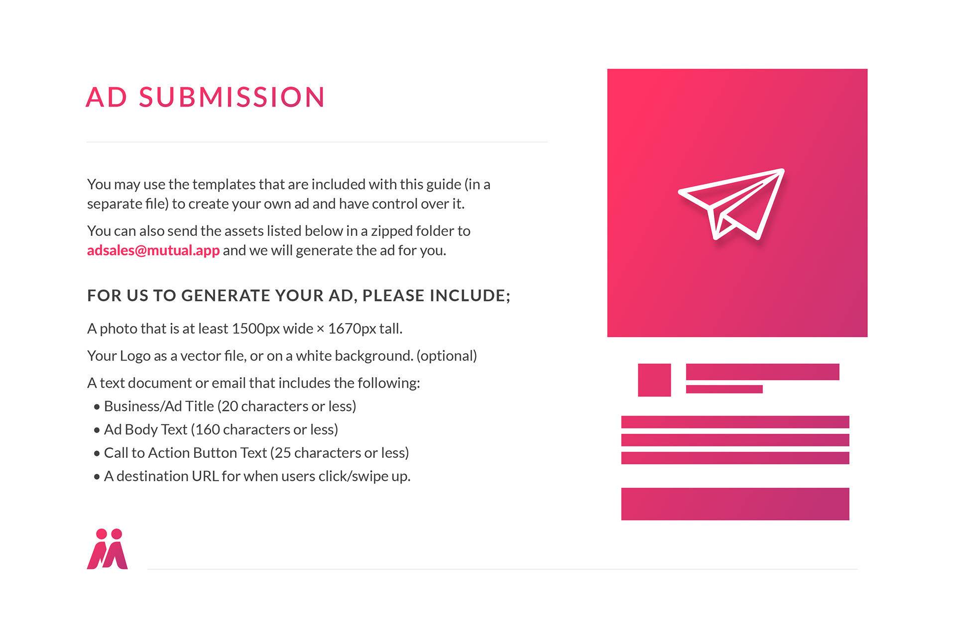

Mutual shows over three million ad impressions per month, which helps keep the free version free.
Advertising at BYU
We have ran ads at basketball games in 2019, and will be running our first motion ads at the upcoming BYU Football Games in 2019.
The Provo Team
(plus Spouses!)
You are all awesome!
